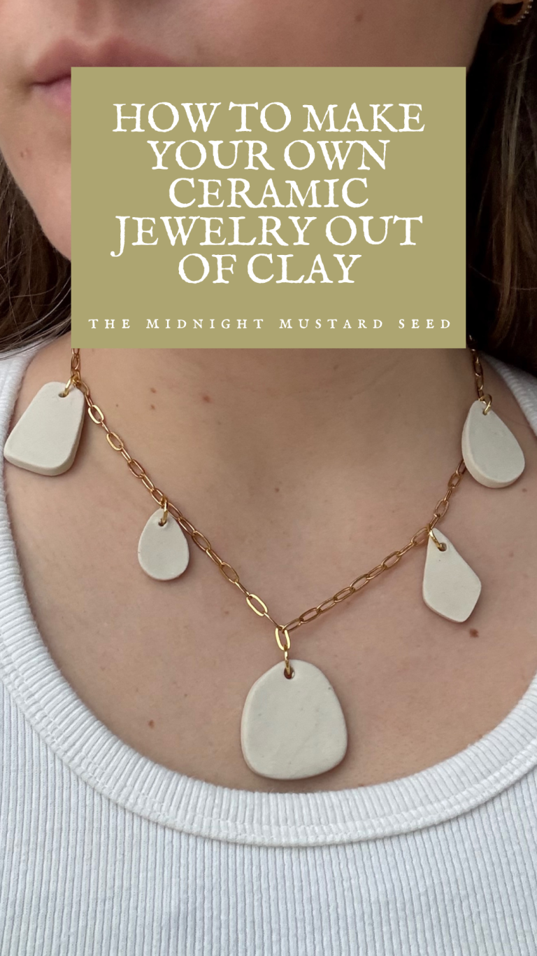
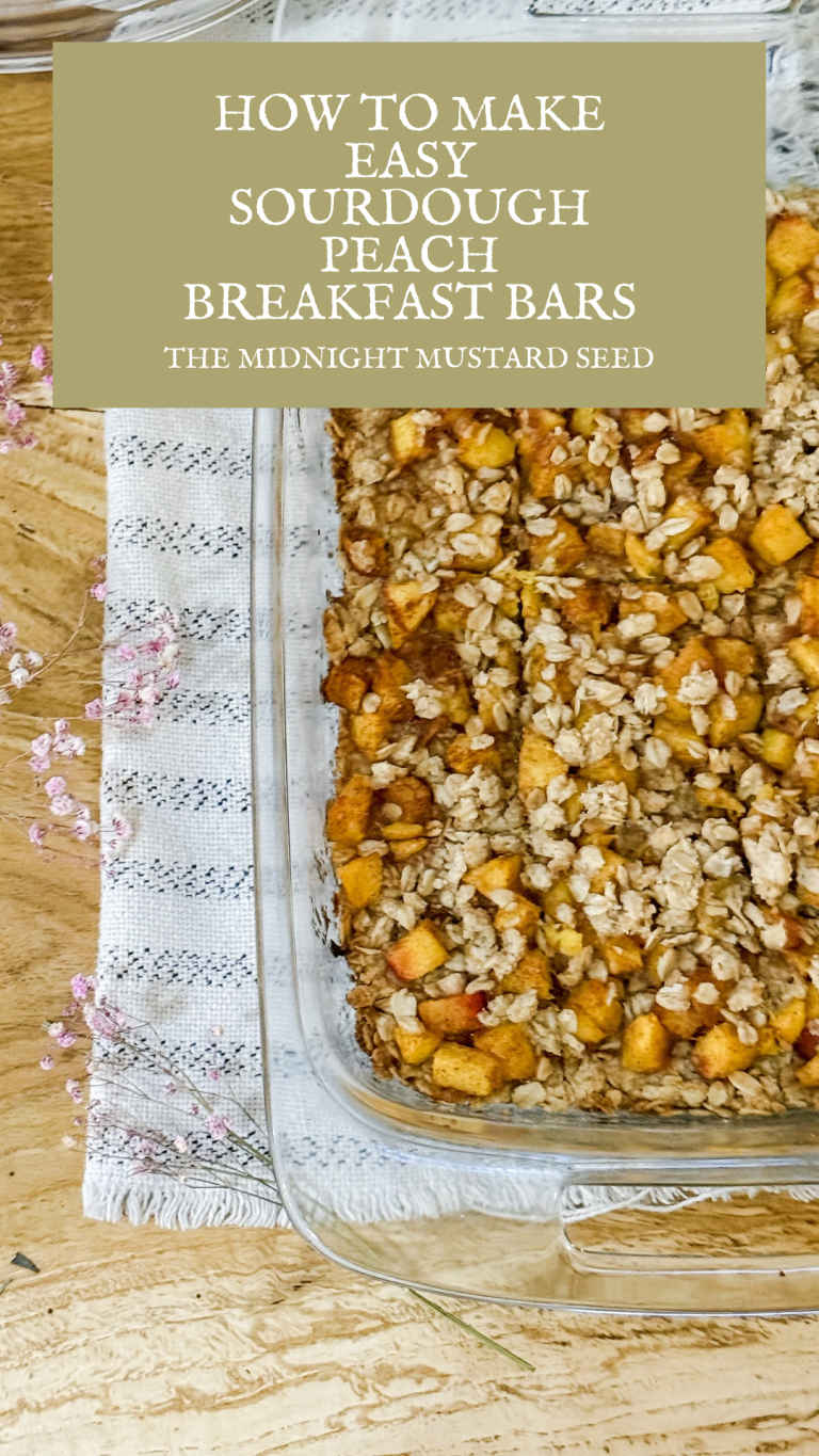
Acrylic Painting: Why and How To Use Colored Grounds
Acrylic painting is truly an amazing medium. It’s quick drying characteristic gives painters the ability to quickly layer paint as well as add a whole lot of detail if that’s what the painter wants to do! It can be smooth or textured, thick or transparent when watered down. Fluid acrylics allow light to come through and act similarly to traditional watercolors Acrylic paint is so versatile, it’s no wonder that it is loved by so many artists of all different styles.
I have personally used acrylic paint for years, but often felt like my acrylic paintings fell flat-especially when I compared them to my oil paintings. Oil paint has a way about it that allows the light to shine through. Colors seem to pop a little bit more. Not saying the grass is greener on the side of oil painting, but I wondered if there was a way to literally make my grass greener in my acrylic paintings. I found myself wondering why my paintings looked dull or flat when I tried to use acrylics. Then, I found a technique to help my acrylic paintings look brighter and more exciting. This technique is now one that I use every time I pick up a paintbrush.
While acrylic paint is incredibly user friendly across the board, it can be tricky to get your coloring just right. Too many layers or the wrong color palette can make paintings appear muddied and dull. If you have ever wondered if there is a technique that can take your acrylic paintings to the next level, you may want to try out using colored grounds. This tried and true technique works beautifully with almost all artistic mediums. Try it out on smaller paintings or larger canvases- whatever you choose, it is worth a try! Using toned grounds can create beautiful dimension and color that is unparalleled.
What Are Colored Grounds?
Okay, so what are colored grounds? A colored ground is essentially a layer of color that you apply to your painting surface before you begin painting your artwork. For example, if you were painting on canvas and wanted to use a colored ground, you would paint a thin layer of color on the white canvas almost like a colored primer. Using colored grounds enhances the colors in your artwork, depending on the colors you choose. A ground color can be applied on the entire canvas or just on a portion of the canvas if you want a particular element to stand out.
When Are Colored Grounds Used?
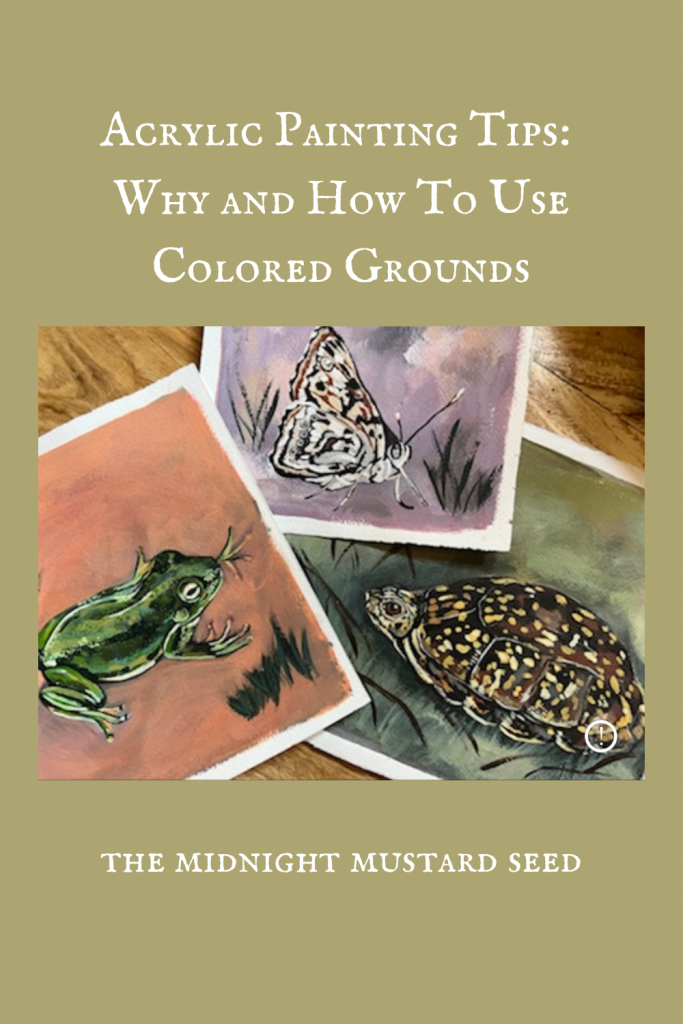
Coloured grounds can be used anytime a painter wants to enhance the colors in their artwork! Portrait painters often use colored grounds before they paint their portraits because it helps prevent skin tones from looking too muddy, dull, chalky, or unnatural. This technique is also commonly used in landscape painting for a similar reason. Grasses, trees, dirt, and earth tend to blend together and look a bit garbled without a colored ground. With the right tonal ground, natural elements can really pop and appear vibrant.
Another great way to take this painting technique to the next level is to paint a thin layer of your toned ground and then add different colors of your colored ground to show where shadows or highlights will be in your final painting. For example, use the darkest shade of your toned ground that you can mix- almost black. Use that dark color to block out shadows or give weight to your painting by sketching out the ground or “heavy” objects. Repeat this process with a lighter tone of your background color for highlights or bright areas like the sky or sun-filled tree line. Use the middle tone to cover the entirety of your canvas or to block in those mid range areas. These little layers of paint work so well together to create realistic dimension and colors that pop.
Can You Use This Painting Technique With Other Mediums?
The use of colored grounds is not limited to just acrylic paint. Colored grounds are most commonly used in oil painting or acrylic painting, but can be used with most any paint, colored pencil, chalk pastels or oil pastels. Many pastel or colored pencil artists will paint a thin layer of acrylic paint as their tonal ground. Other colored pencil or pastel artists will utilize colored papers in the same way- often grey, manilla, black or gray. A white ground can make other mediums fall flat as well so why not try a different color?!
Using The Color Wheel
When it comes to color choice, there is a little more thinking and nuance that goes into the process. You can’t just slap any old color on your canvas and expect amazing results. While amazing results are possible, the influence that your colored ground has on your painting depends on the colors you choose! Certain colors will make other colors pop. Those same background colors can make different colors in your painting look muddy or undesirable. One trick that I recommend doing working with a limited palette while beginning to use colored grounds. I would actually recommend choosing two complementary colors to begin with.
What Are Complementary Colors?
Complementary colors are colors that are located across from each other on the color wheel. These sets of colors bring out the vibrancy in their complement. This color play helps to create a more lively painting or artwork. For your first time using colored grounds, choose a pair of complementary colors from the chart below. Decide which color you want to use in your painting and which one you will use as the colored ground color. For example, if you want to create a painting that has beautiful pops of green in it, like in a luscious landscape, you can use red as your colored ground to really make that green shine. In case things are still a bit confusing, I have listed the pairs of complementary colors below.
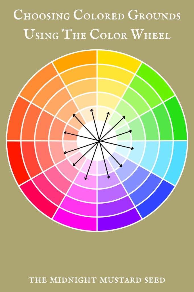
Complementary Color Pairs
-Red-Green
-Orange-Blue
-Yellow-Purple
In the same manner of using a limited color palette, you can also work in color groups of threes called triads. Triads are colors that are evenly spaced on the color wheel. These groups of colors play nicely together and often enhance on another in artwork. Triads are commonly used in graphic design and many art forms because they balance each other so well. You could always choose one color as your colored ground and add pops of the other two colors heavily in your painting to create an engaging piece of art. I have listed the color triads below for you as well.
Color Triads
-Red, yellow, blue
-Orange, green, purple
Of course, you don’t have to use complementary colors or triads as your only colored grounds option. Many artists use blacks, burnt umber or burnt sienna to get that vintage, sepia-tone effect. Other artists love to use a sunny golden yellow to make their blue skies pop or their portraits glow. I personally love to use a fluorescent pink because it really makes those earthy greens and blues stand out. You may enjoy it as well if you paint a lot of natural subject matter. While these are commonly used traditional colors for toned grounds- you can use any color you like! Don’t be afraid to experiment- you may find a colored ground you absolutely love. Below you can find a short clip of me creating a colored ground with both pinks and blacks.
https://www.instagram.com/share/BALcGDX5_P
You may find yourself where I did-frustrated with lackluster acrylic paintings. Don’t give up on this wonderfully versatile medium. You simply need to add using colored grounds to your bag of tricks. If you are looking for a way to step up your artwork with color play, colored grounds are a great thing to try out next time. With intentional color scheme choices and a good colored ground, you can create work that really stands out. Not only will it help elevate your paintings, but it will help you train your artistic eye with the way colors dance together on the canvas. Add this technique to your process of painting, and you are bound to get great results. Don’t forget, art isn’t about perfection. Have fun creating and enjoy the process!
I hope this blog post has helped you as you learn about painting! For more painting tutorials, tips tricks, and other art projects click HERE.